Secrets in the Kitchen
In my Advertising Campaigns course, we were able to work with Secrets in the Kitchen, a local pasta sauce company from Rhode Island. This was my first real experience creating advertisements, copy, and coming up with other creative placements within a team for the local pasta sauce brand. This was a challenging yet fun campaign to work on as the sauce was amazing and it was the first time working with others in a team within an agency-like classroom environment.
our First Steps
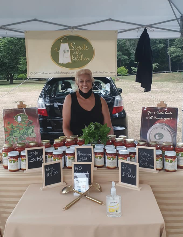
Our first step was to meet with the owner, Karen Greene, to listen to the brand’s history, story, and any information that would be helpful to us to decide our route with the campaign. This first hand information helped us build our positioning statement and our brand pyramid to guide us along the creation of this campaign.
Our Problem and positioning Statement
For Secrets in the Kitchen, the brand problem was lack of consumer knowledge of the brand and what it can offer. We crafted a positioning statement to capture our problem and create a plan on how to fix the consumer problem.
To middle class consumers ages 30+ looking for a premium, homemade sauce their whole family will enjoy, Secrets in the Kitchen is the savory, handmade marinara sauce that will remind their consumers of all the fresh ingredients picked right from their hard-working grandpa’s garden, giving a sense of nostalgia - because Karen Greene crafts each small batch using her grandfathers recipe with fresh hand crushed plum tomatoes, bay leaf instead of oregano, elephant garlic and zero sugar, the taste is real and an easy way to make a meal standout/delicious. The sauce is healthier than others because of low sodium, sugar, and no additives.
Our Creative works
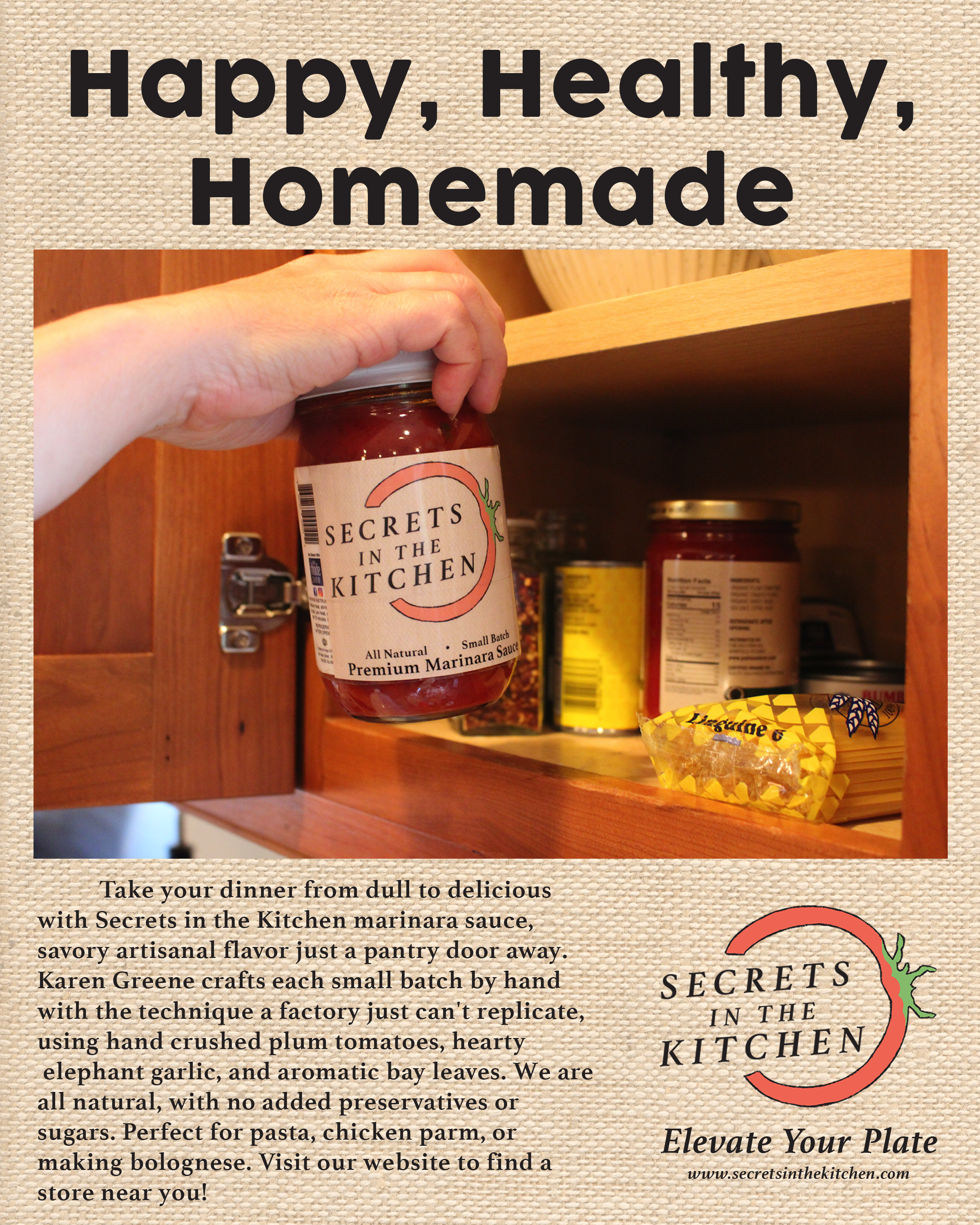
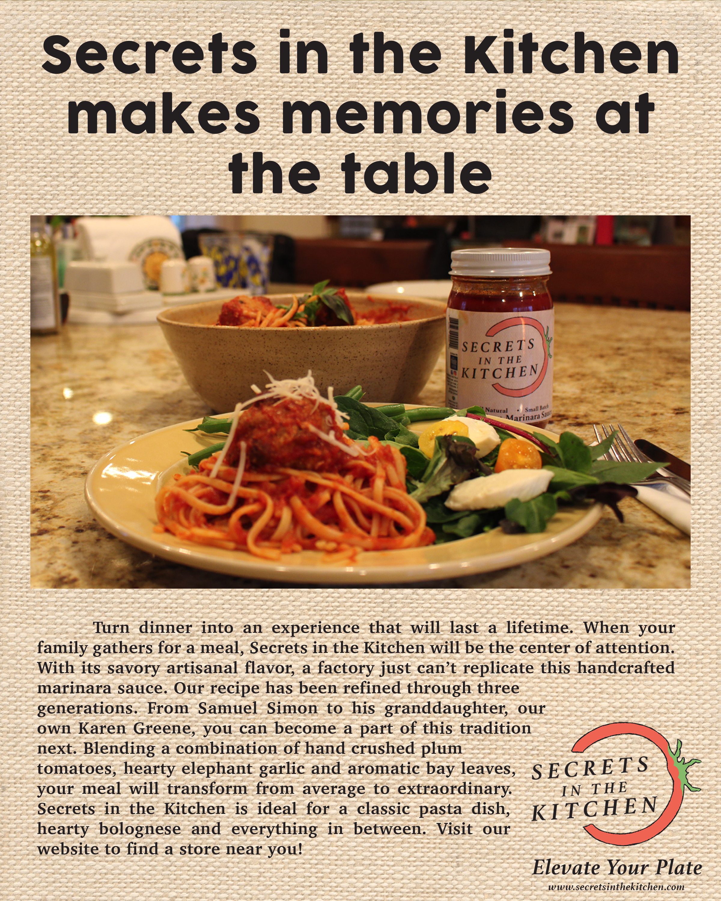
Our Magazine Spot
Our Logo Rebrand
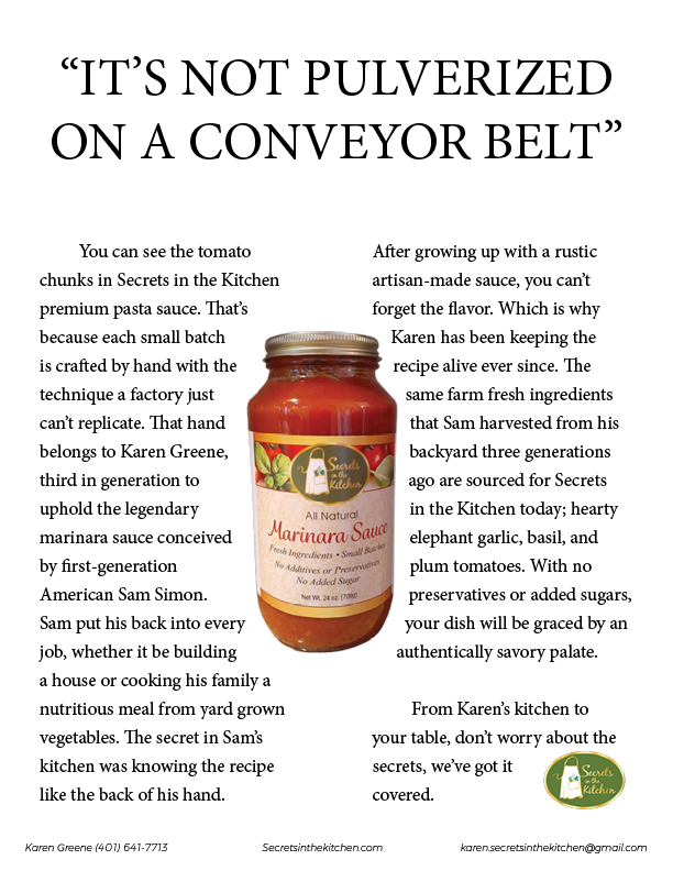
We decided one of the first steps was to redesign the current logo for the brand to target the audience of 25 to 50 year old financially stable, food centric people who care about what kinds of foods they are eating. We decided to use a bright red tomato to catch the attention of those looking at the other jar labels. The rustic artisanal text was chosen to create that homemade feel to the brand. We aimed to declutter the previous logo while still pursuing the brand’s character.
Our Jar Redesign
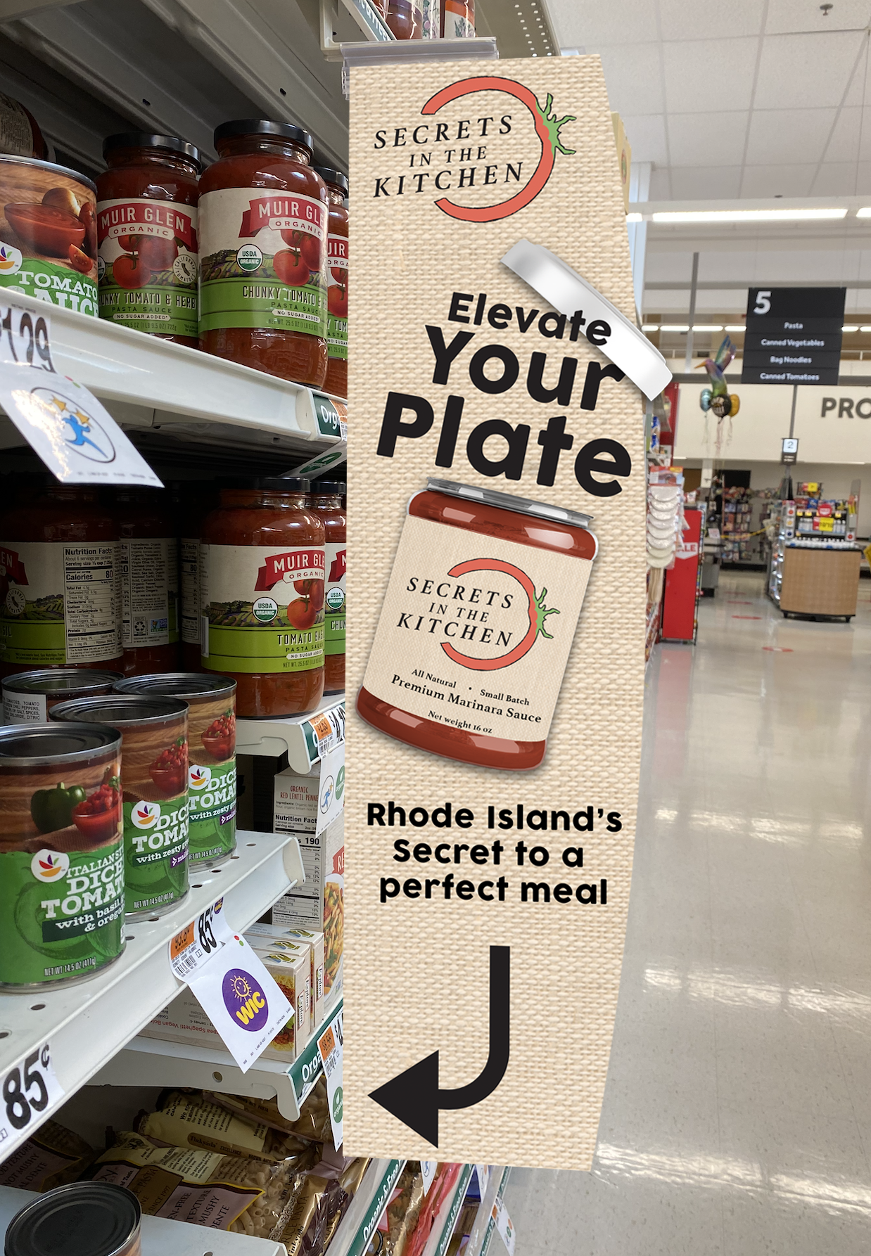
We aimed to create a jar that not only catches the eye, but will stamp consumers mind with what is important from this brand, Secrets in the Kitchen. With our new jar design, we made sure to keep the logo at the center of attention and lead into what was in the jar, an all natural, small batch, premium marinara sauce. These words were chosen carefully as we wanted to adhere and connect in with the values of our consumers
Our Copy Ads
Our OOH ADS
